How to Make a Realism Tattoo Stencil That Actually Helps You Tattoo
• by DND Applications • 9 min read
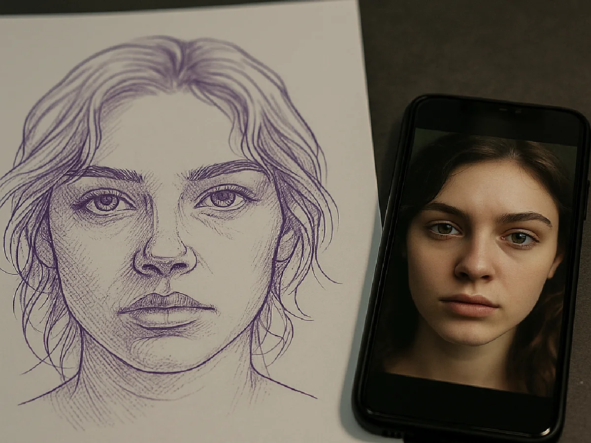
A realism stencil is a different object from a traditional one. There is no bold outline to follow, because the finished tattoo has no outline. Instead the stencil is a value map: a few solid lines where edges are hard, broken lines where shadows fade in, and nothing at all where the skin stays light. Learn to build that map and realism gets dramatically more predictable.
Key takeaways
- Solid line = hard edge or outline. Dotted line = soft shadow boundary. No line = leave it to the reference.
- Map three to five value zones, not twenty. The stencil holds structure; texture is added at the chair.
- Convert from a sharp, evenly lit photo, thin the guides, thicken the hard edges, and test print at the real size.
What a realism stencil actually contains
| Mark | Meaning | Example |
|---|---|---|
| Solid line, medium weight | Hard edge that will be lined or sharply shaded | Eyelid crease, edge of the nose against cheek, lip line, jaw against background |
| Thin solid line | Boundary between two value zones | Where the cheek turns from mid-tone to shadow |
| Dotted or dashed line | Soft transition, shade across it | Shadow under the cheekbone, the roll of a muscle, fur direction |
| Dots or short hatching | Darkest zone, pack black or heavy grey | Pupil, nostril, deep hair shadow |
| Nothing | Highlight or light skin | Forehead, bridge of nose, catchlight |
Step 1: Choose a reference that can become a stencil
- Sharp and well lit. Side light that creates clear shadow shapes is better than flat flash light, because shadow shapes are what the stencil records.
- Subject fills the frame. A face at 300 pixels wide has no edges to extract.
- Simple background. Or crop it out before converting.
- Agree the crop with the client before you spend an hour on the stencil.
Step 2: Map the values
Squint at the reference until it collapses into three to five tones: highlight, light, mid, dark, darkest. Those tones are the zones your stencil will separate. Realism beginners draw twenty zones and the stencil turns into a grey mush that smears on transfer. Five zones, cleanly separated, produce a stencil you can actually read with ink on the skin.
Step 3: Convert and set the line hierarchy
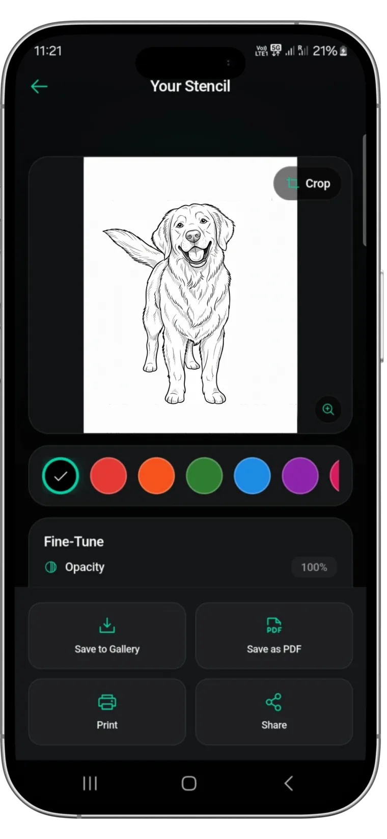
- Import the photo into a stencil app. Stencify extracts the edges and drops colour and shading in about 30 seconds.
- Thicken the hard edges: eyes, nose edge, lips, the outer contour against the background.
- Thin the zone boundaries to the lightest line weight that still prints. These are guides, not lines you will tattoo.
- Break soft edges into dots or dashes. If the app gives you a solid line where the shadow fades gently, erase sections to dash it, or use dots.
- Remove texture. Skin pores, stray hairs, fabric patterns. Add them from the reference at the chair.
- Mark the darkest shapes with hatching or a few dots so you know where to pack.
Portraits: where the likeness lives
- Eyes. Spend most of your stencil effort here: iris edge, pupil, the exact position of the catchlight as a small empty circle, upper lid line solid, lower lid line thin.
- Nose. Only the shadow side edge and nostril shapes. Never a line around the whole nose.
- Mouth. The line between the lips is solid; the outer lip edges are dotted or absent.
- Hair. Flow lines showing direction and the few dark shapes, not strands.
- Proportion check. Flip the stencil horizontally on screen. Errors in symmetry jump out.
Animals: direction over detail
Fur, feathers and scales tempt you to draw everything. Resist. A lion's mane needs ten or twelve flow lines and the dark shapes between them; the artist adds the fur. A leopard's spots are drawn as clean closed shapes. Eyes and nose get the same treatment as a human portrait. The animal stencils in our designs gallery show how little is really needed.
Fine line realism
Fine line realism uses a single thin outline and almost no hatching, so the stencil is closer to the finished tattoo than in black and grey realism. Keep lines continuous and even, remove every stray mark, and print at 300 dpi if you can; a 203 dpi printer will break lines that are too thin. Test on practice skin once, because fine line stencils show every wobble.
Step 4: Test print and size
Print on plain paper at 100% and hold it against the client. Details that vanished mean the stencil is too fine for the size; simplify. Details that look cartoonish mean the lines are too heavy; thin them. Only then print on stencil paper. Printer darkness at the middle setting, then adjust one step at a time. Our printer guide covers the hardware side.
Common realism stencil mistakes
- Outlining everything. Realism has no outline. Use the contour line against the background only where the edge is genuinely hard.
- Grey in the stencil. It does not transfer. Convert gradients to dots or hatching.
- Too many zones. Five, not twenty.
- Skipping the size test. A stencil that works at A4 can fail at the real two-inch placement.
- Trusting the first conversion. The app's output is the start. The hierarchy decisions are yours.
Do the extraction in 30 seconds, spend your time on the hierarchy
Stencify takes the photo and does the edge extraction, then gives you line weight and contrast controls to build the hierarchy, a try-on preview to check size on the client, and a PDF export sized for stencil paper. It runs on iPhone, iPad and Android: get Stencify on the App Store or on Google Play.
Frequently asked questions
What do dotted lines mean on a realism tattoo stencil?
Dotted or broken lines mark soft edges and shadow boundaries that will be shaded, not lined. Solid lines mark hard edges that will be outlined or where a value changes sharply. Reading a stencil this way is what lets a realism piece look painted rather than drawn.
How much detail should a realism stencil have?
Less than you think. The stencil should hold the proportions, the major value boundaries and the few hard edges that define the subject. Texture such as fur, pores and fabric weave is added at the chair from the reference, not drawn into the stencil.
What printer settings are best for realism stencils?
Use a 300 dpi thermal printer where possible, set darkness to the middle and test. Keep line work at least 2 pixels wide at print resolution. Smooth grey gradients do not transfer, so convert them to dots or hatching before printing.
Can I make a portrait stencil from a phone photo?
Yes, if the photo is sharp, evenly lit and the face fills the frame. A stencil app extracts the edges; you then thin the guide lines, thicken the hard edges, and check it at the real size before printing.
Related reading
- How to Make a Tattoo Stencil From a Picture - the general photo workflow
- Tattoo Stencil Designs You Can Print Today - see realism stencils done right
- Best Tattoo Stencil Printers - resolution and darkness settings
- Stencil Technique by Style - how other styles differ
From photo to realism stencil in about 30 seconds
Stencify extracts the edges that matter, lets you set line weight, and exports at real size for stencil paper.