Stencils That Show Up: Adapting Contrast and Line Weight for Every Skin Tone
• by DND Applications • 5 min read
A stencil only works if you can see it. On lighter skin, a standard purple transfer stands out with little effort, so many artists never think about visibility. On deeper skin tones, that same tattoo stencil can disappear under studio lighting, leaving you guessing at your own line work. Adapting the stencil to the client in the chair is a practical skill, and it starts well before the transfer paper comes out.
Why Visibility Changes With Skin Tone
Contrast is relative. A line reads because it is darker or lighter than what surrounds it, and the amount of separation you need shifts with the client's undertone and depth. Thin, faint lines that look elegant on pale skin can drop below the visibility threshold on richer tones. The goal is not a heavier tattoo, it is a stencil with enough contrast against that specific skin to guide your hand confidently through the whole session.
Adjusting Line Weight for the Client
When a stencil risks fading into the skin, a small increase in line weight buys back visibility without changing your design. Slightly thicker, more defined lines hold their edge through the transfer and stay readable under gloves and ointment. This matters most on fine line and single needle work, where the original stencil is already delicate. Thickening the stencil slightly does not mean thickening the tattoo; it means giving yourself a map you can still read on the third hour.
Choosing the Right Transfer Color
Standard purple is the default, but it is not the only option. On deeper skin tones, darker or higher saturation transfers often read more clearly than a thin violet line. Test a small area if you are unsure, and pay attention to how the stencil looks under the actual lighting you tattoo in, not just at the front desk. The right transfer color is simply the one you can follow without squinting.
Lighting and Setup Matter Too
Even a strong stencil struggles under weak or yellow light. Position your task lighting so it rakes across the stencil rather than washing it out, and keep a movable lamp within reach for tight or curved areas. Good lighting is the cheapest visibility upgrade available, and it works alongside every other adjustment rather than replacing it. Before you blame the stencil, check the light falling on it.
Building Contrast Into the Stencil From the Start
The most reliable time to fix visibility is before you print. A stencil generated with strong, deliberate contrast and clean line separation gives you the most room to adapt at the chair. Starting from a muddy, low contrast source leaves you fighting the stencil on top of everything else. When the digital line work is already crisp, adjusting weight or transfer color for a specific client becomes a small tweak rather than a rescue.
How Stencify Helps You Adapt
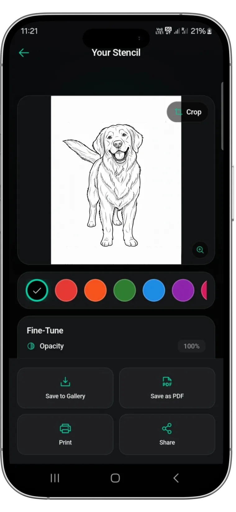
Stencify converts any reference into clean, high contrast line work, and its adjustable controls let you strengthen contrast and line weight before you ever print. That means you can prepare a stencil that will read clearly on your specific client rather than hoping a generic transfer holds up. For artists who tattoo a full range of skin tones, a dependable image to stencil workflow removes the guesswork and starts every piece from a sharp, adaptable base.
Want stencils that read clearly on every client? Get Stencify on the App Store and control contrast before you print.
Related reading
- Mastering Contrast and Line Weight - the foundation of a flawless tattoo stencil
- Precision in Contrast - the foundation of a lasting stencil tattoo
- Mastering Contrast - preparing reference images for the perfect stencil
A stencil for every client
Stencify gives you contrast and line weight control in seconds, so your stencil stays visible on every skin tone you work with.