Roman Numeral Tattoos: Dates, Fonts and Clean Stencils
• by Stencify • 6 min read
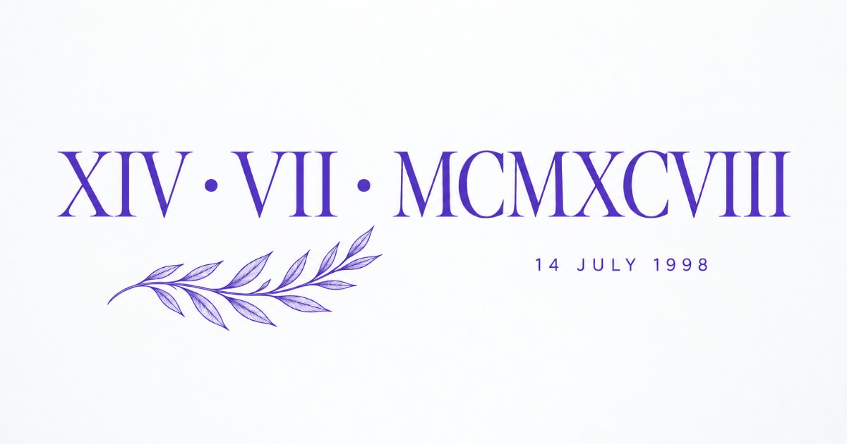
Roman numeral tattoos look simple, which is exactly why mistakes slip through. A wrong year, a date in the wrong order or a font whose thin serifs vanish after healing all end up on skin for good. This guide covers writing the numbers correctly, choosing a typeface that holds up, and building a stencil where every letter stays separate.
Key takeaways
- Seven symbols, six subtractive pairs, and never more than three of the same symbol in a row. That covers every date.
- Agree the date order with the client in writing: day, month, year and month, day, year give different tattoos.
- Keep capitals about 5 mm tall or more and open the letter spacing, because rows of I and X blur together first.
- Check the stencil character by character against the written number before it touches skin.
How Roman numerals work
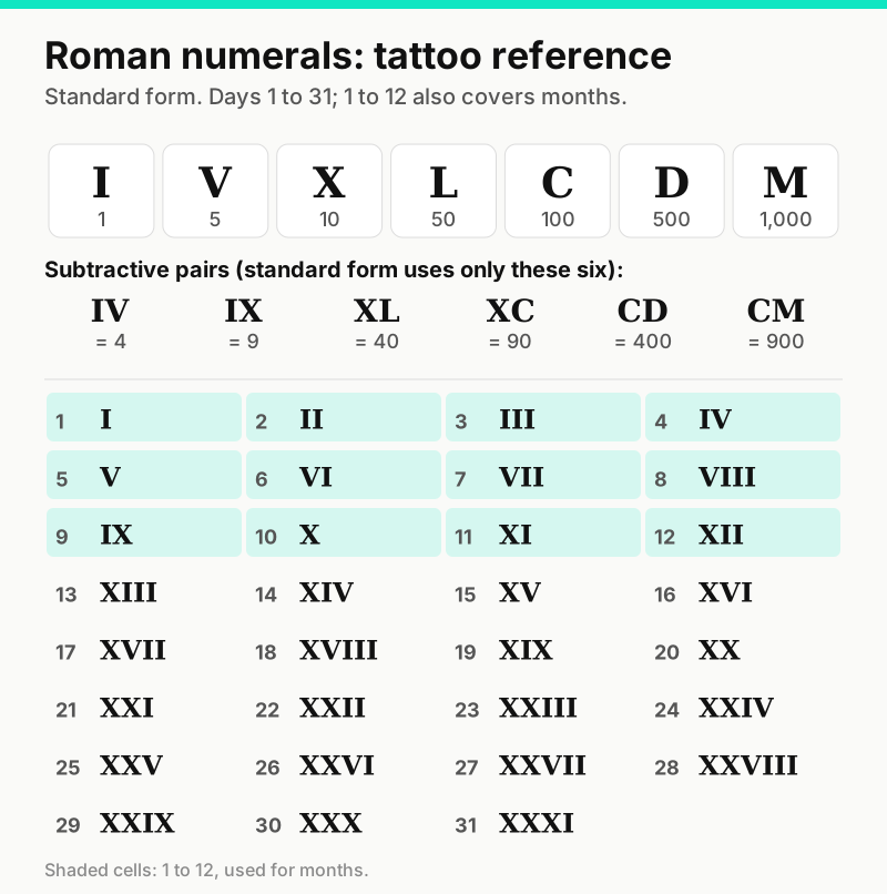
Roman numerals use seven letters: I (1), V (5), X (10), L (50), C (100), D (500) and M (1,000). You write them from largest to smallest and add them up, so XVII is 10 + 5 + 1 + 1 = 17.
The one twist is subtraction. When a smaller symbol sits directly before a larger one, it is subtracted. Standard modern usage allows only six of these pairs: IV (4), IX (9), XL (40), XC (90), CD (400) and CM (900). Anything else, such as IC for 99 or MIM for 1999, is not standard, even if an online converter or a client's friend suggests it.
Two more rules catch most errors. No symbol repeats more than three times in a row, so 4 is IV rather than IIII in standard form, and there is no zero. A month written as 07 is simply VII.
Writing a date correctly
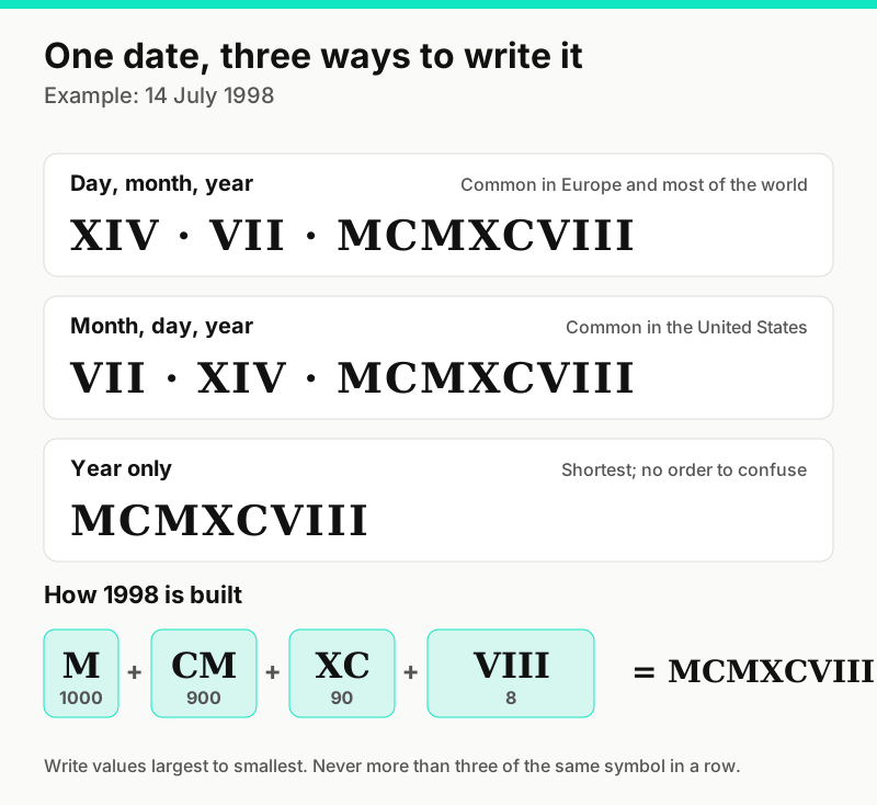
Convert each part of the date separately: the day, the month and the year. Never convert a date as one long number. Then write the year by splitting it into thousands, hundreds, tens and units.
- Thousands: 1 is M, 2 is MM.
- Hundreds: 900 is CM, 800 is DCCC, 0 adds nothing.
- Tens: 90 is XC, 80 is LXXX, 20 is XX.
- Units: 8 is VIII, 9 is IX, 4 is IV.
So 1998 is M + CM + XC + VIII, written MCMXCVIII. 1987 is MCMLXXXVII, 2015 is MMXV and 2024 is MMXXIV.
Day first or month first?
Most of the world writes day, month, year. The United States usually writes month, day, year. For dates where the day is 12 or lower, both orders produce valid but different tattoos: 3 April and 4 March look almost identical in numerals. Ask the client to write the date out in words on the consent form, then convert it yourself and have them read the numerals back to you.
Separators
Dots, middle dots, short dashes, spaces and vertical bars all work. Pick one style and use it between every part. Give the separator about one letter width of space on either side so it does not touch a neighbouring I or X. Avoid decorative lines above the numerals unless the client wants them: in one historical convention, a bar over a numeral multiplied it by 1,000, and some readers will notice.
Choosing a font that holds up
Roman numerals are all capitals, and many of them are made of straight vertical strokes. That makes the font choice more important than it looks.
- Classic serif capitals (in the style of carved Roman inscriptions) look right for the subject, but the thin strokes and fine serifs are the first thing to soften as a tattoo ages. Go a little larger, or pick a serif with sturdier hairlines.
- Simple sans serif capitals have even strokes and stay legible at smaller sizes. They suit fine line work and minimal placements.
- Typewriter and slab serif faces sit in between: even strokes with clear serifs that separate repeated letters well.
- Script and calligraphy styles rarely suit numerals. The letters are hard to tell apart once they connect.
Whatever the style, keep stroke weight consistent across the whole date. Mixing a heavy year with a light day and month reads as a mistake from a distance.
Spacing: where numeral tattoos go wrong
A year such as MCMXCVIII or MMXXVIII has long runs of similar vertical strokes. Ink spreads slightly under the skin as a tattoo heals and ages, so letters that nearly touch on paper can merge into a dark block. Three habits prevent that.
- Open the letter spacing by about 10 to 20 percent over the font's default, more for bold styles. Our lettering stencil guide explains why spacing closes up over time.
- Keep serifs apart. Two serifs that touch, as in XX or II, should have a visible gap of about 1 mm at final size.
- Watch the I runs. III, VIII and XXIII are the most likely to blur. If the placement is tight, a sans serif or a slightly larger size usually fixes it better than squeezing.
Size and placement
As a starting point, keep capital letters about 5 mm tall or more for a simple sans serif and a little taller for serifs with thin strokes. Some fine line artists work smaller, and how small is safe depends on their technique, so treat this as a guide rather than a rule.
Length grows quickly. A full date such as XIV · VII · MCMXCVIII has 15 letters plus two separators, and at 5 to 6 mm tall it typically runs somewhere around 7 to 10 cm depending on the font. That fits along an inner forearm, collarbone, ribs or upper back comfortably. On a wrist or finger, a single number or a year on its own is usually the better choice. Our tattoo size chart lists typical sizes by placement.
For vertical placements such as the spine or the side of the ribs, you can rotate the line of text or stack the letters. Rotated text is easier to read. Stacked numerals work best with sans serif capitals so each letter keeps the same width.
Making the stencil
- Type, do not trace. Set the numerals in a design or text tool so every letter is identical in weight. Hand-traced capitals drift.
- Set the real size. Measure the placement and size the text to that measurement. Our sizing and printing guide covers this step and printing at 100%.
- Curve the baseline on a forearm or collarbone so the line reads level when the body is relaxed.
- Mirror only if you trace by hand onto hectograph paper. Printed thermal stencils come out the right way.
- Proofread letter by letter. Compare every character against the written conversion, ideally with the client. One missing I changes the year.
If you work from a phone or tablet, Stencify can turn typed text, a sketch or a photo of the client's lettering into clean stencil lines, with line weight control and a try-on preview on the body at real size, then export a PNG or PDF for A4 or US Letter. As with any automated conversion, proofread the result against your written numerals before printing. It runs on iPhone, iPad and Android with two free uses: get Stencify on the App Store or on Google Play.
Frequently asked questions
What is 2000 in Roman numerals?
2000 is MM. The years after it follow the same pattern: 2001 is MMI, 2010 is MMX, 2024 is MMXXIV and 2026 is MMXXVI.
How do you write 1999 in Roman numerals?
1999 is MCMXCIX: M (1000) + CM (900) + XC (90) + IX (9). Shortcuts such as MIM are not standard and are a common tattoo mistake.
Why do some clocks show IIII instead of IV?
Clockmakers have long used IIII on watch and clock faces as a design tradition. On a tattoo, IV is the standard form and the one most people will read correctly, but IIII is a deliberate style choice some clients want.
How big should a Roman numeral date tattoo be?
Keep capital letters about 5 mm tall or more, and taller for serif fonts with thin strokes. A full date with a four digit year is usually several centimetres long, so measure the placement before choosing the format.
Related reading
- Tattoo Lettering Stencils - size, spacing and mirroring for any word
- How to Size and Print a Stencil - measuring and printing at 100%
- Memorial Tattoo Ideas - dates and names that mean something
- Morse Code Tattoos - another way to hide a date or name in plain sight
Lettering that prints at the size you planned
Stencify turns typed text or a sketch into clean stencil lines, previews it on skin at real size and exports for A4 or US Letter.